Redesigning 1-on-1 conversations
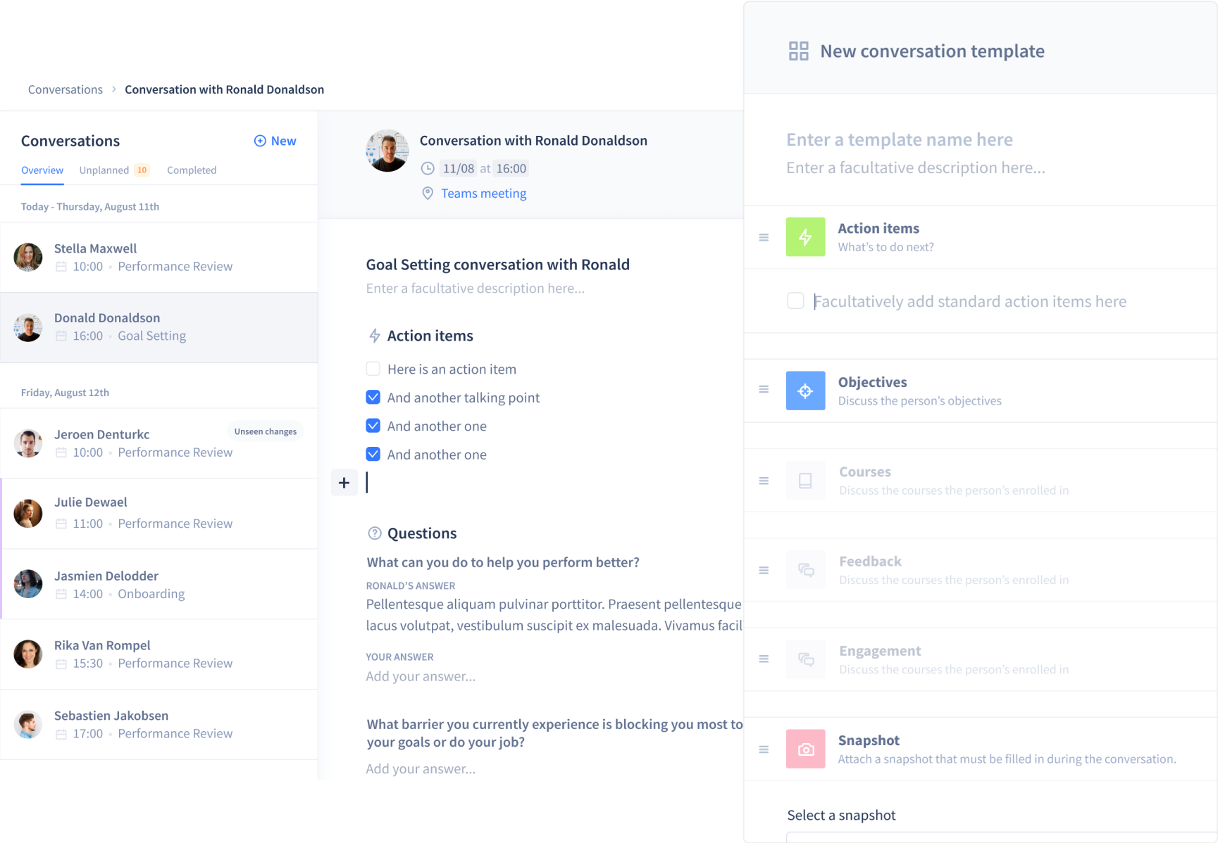
I redesigned Intuo's 1-on-1 conversation system to make feedback exchange easier, simplify preparation and make meetings more productive for both managers and employees.
About
I worked as a Product Designer at Intuo from Jul 2019 to Mar 2021. This project ran from Oct 2020 to Mar 2021.
My responsibilities
- UX & UI design
- Prototyping & testing
- Visual Design
Tools
- Overflow (userflows)
- Maze (user testing)
- Figma
Overview
Intuo is a talent enablement platform. It connects insights from all aspects of an employee journey. From measuring engagement, and facilitating one-on-one conversations, to tracking objectives and providing employees with an easy to use learning system that will drive development.
Problem Statement
After analysing usage data and running user interviews, we identified three core problems with 1-on-1 conversations:
Employees don't know what to talk about
Without good preparation, meetings start slow and lack focus. Employees need help identifying the right topics.
1-on-1 meetings feel like a waste of time
We discovered that one of the main reasons of that is that 1-1 meetings were not always well designed. The key is to make sure that it's a meeting for the employee, rather than a manager’s meeting.
Conversations aren't documented
Without documentation, following up on action items and maintaining accountability becomes impossible.
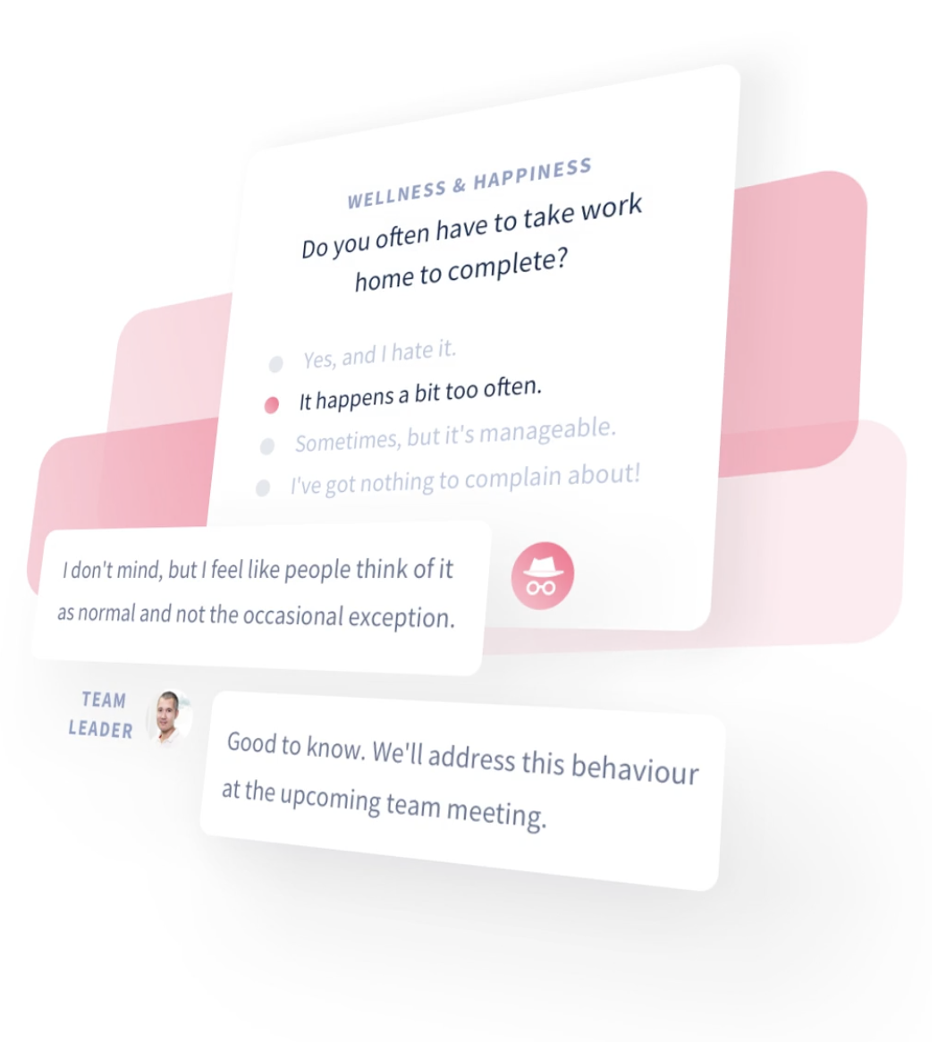
Intuo already had a conversation system, but it introduced its own problems:
- No clear overview of upcoming conversations
- Hard to follow up on action items or find topics
- Creating and planning conversations wasn't intuitive
- The flow felt overly staged and complicated
Process
A brief overview of my process and the methods I used to tackle this redesign.
Competitor Analysis
I mapped how competitors approached the same problems to understand differentiators, strengths and weaknesses. I presented the findings to stakeholders and used them to generate ideas with the team.
User flows & wireframing
With user needs in mind, I mapped out the structure and flow of how conversations could be created. Clear user flow diagrams helped communicate the journey from creating a conversation to conducting one.
High-fidelity prototyping
Using Intuo's design system, I turned the approved wireframes into a full interactive Figma prototype. This gave us something real to put in front of users and iterate on.
User Testing
Covid pushed us to remote testing with Maze. I set up task-based tests (e.g. “Create a new conversation”) to see if users could complete key flows without friction.
Follow-up questions helped us gauge satisfaction and uncover improvements we hadn't considered. We iterated based on the results.
Design handoff
In order for a handoff to be successful, we organised a meeting with the engineering team in order to present the redesign . It is also worth mentioning that an engineer was part of the team at the start of the design process, in order to check the feasibility, gather insights and to make the handoff more successful.
All the necessary design files and assets were shared in the design specs I wrote in Notion.
A weekly follow-up on the progress was also planned and questions could be asked in a public Slack channel in order to communicate transparently.
Launch
We launched gradually, testing thoroughly before rolling out to the full user base. Success was measured against two clear goals:
- 20% increase in conversation usage
- 80% user satisfaction with the new flow
Solution
The new conversation flow works in three simple steps: pick a template, select employees and plan the meeting.
- HR can push conversations to teams when needed
- Predefined templates cover common scenarios like onboarding, goal setting and performance reviews. Custom templates are also supported
- Team leads can plan conversations for their entire team at once
- Employees can self-schedule within predefined time slots
- Future improvement: smart suggestions like flagging people you haven't spoken to in months or surfacing topics based on team sentiment
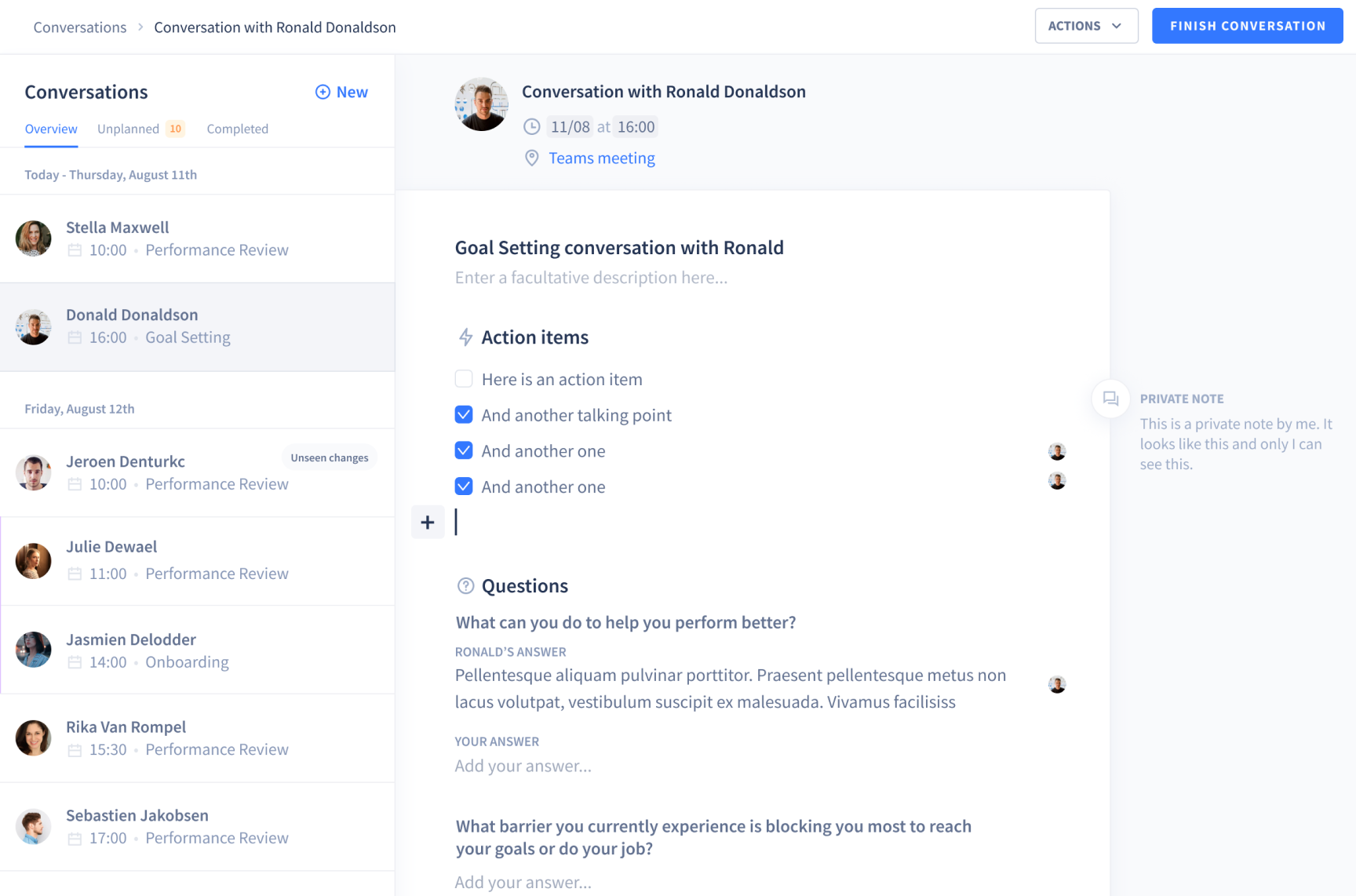
Conversation detail page with action items and questions.
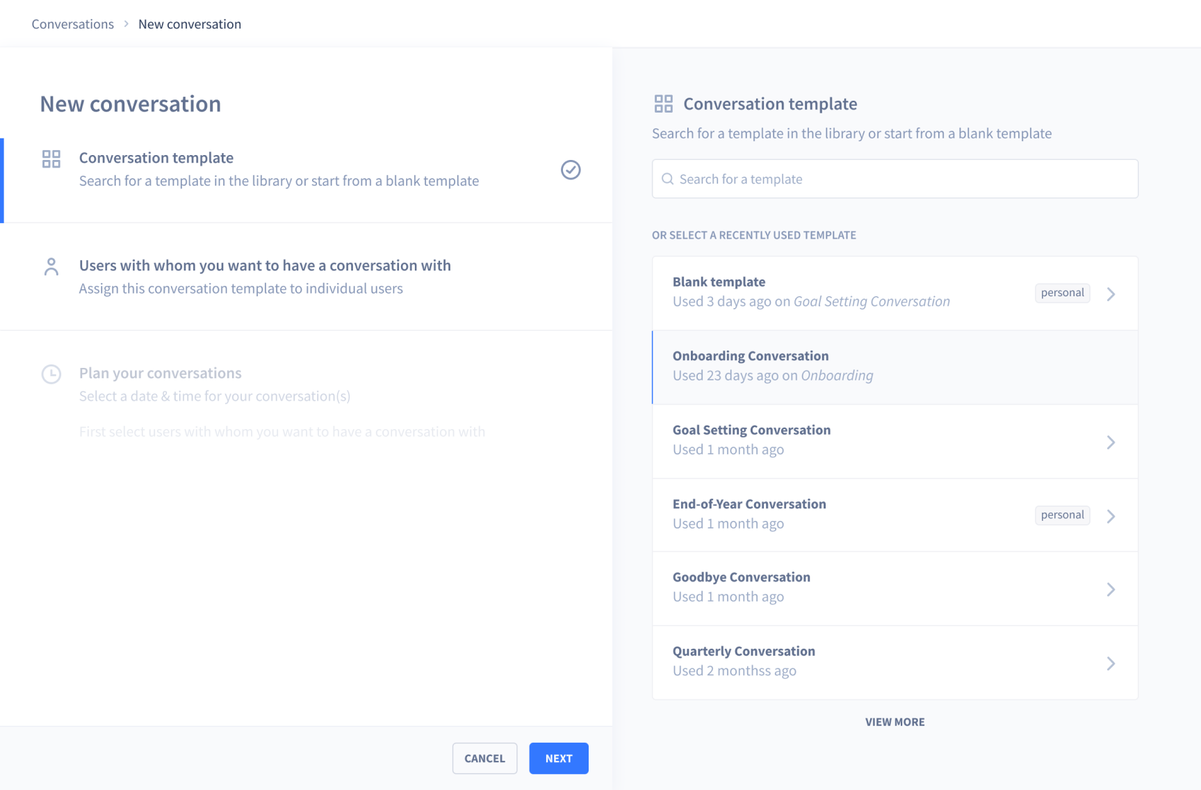
Creating a conversation in three steps.
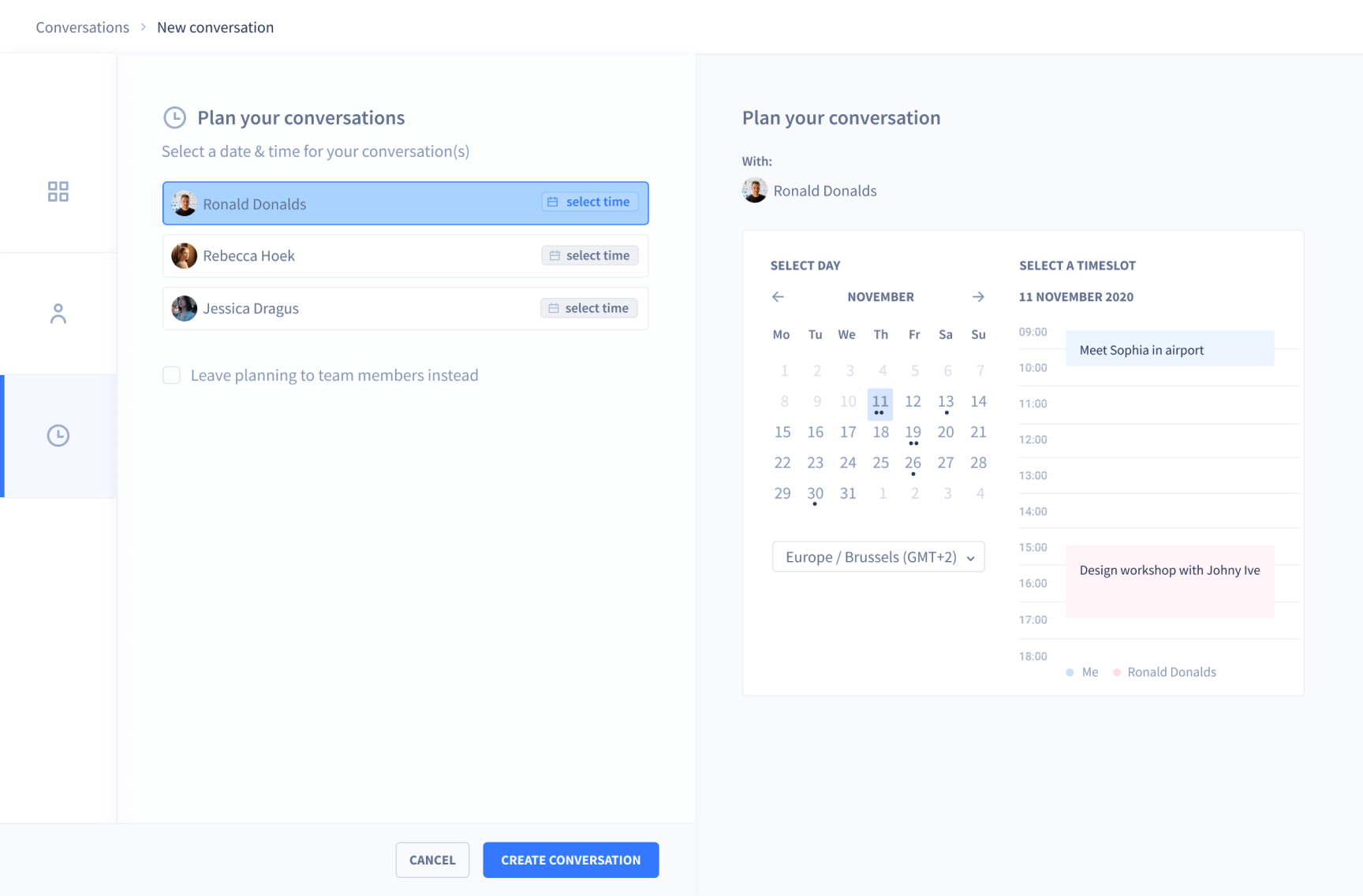
Planning a conversation with availability checking.
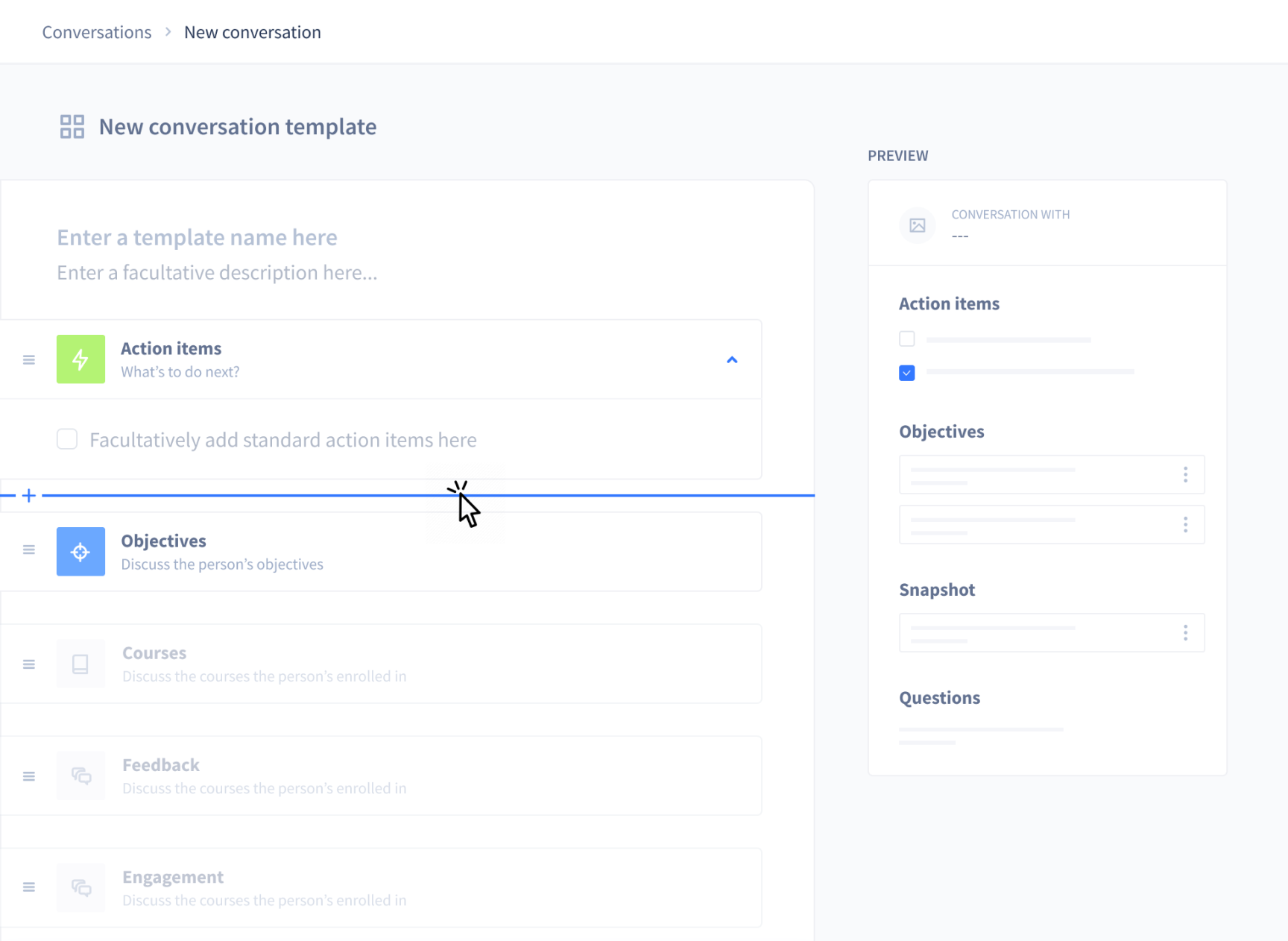
Template editor for defining what each conversation type should cover.
Check out another project
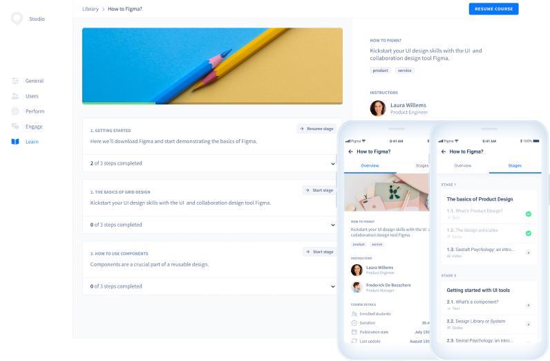
Redesigning a learning management system
Redesigning Intuo's employee training platform to improve content discovery and skill development.