Rethinking invoicing and building a design system
As the sole designer at Teamleader, I redesigned the invoicing module, built interactive prototypes for user testing and laid the foundation for the company's first design system.
About
I joined Teamleader as Product Designer from Feb to Oct 2017. The invoicing redesign took about 2 months.
My responsibilities
- UX & UI design
- Prototype development
- Assist user testing
- Visual Design
Tools
- Sketch
- Abstract
- React prototype
- GitHub
Overview
Teamleader is a SaaS scale-up founded in 2012 that offers an all-in-one platform for CRM, sales, project management and invoicing. At the time, they served over 11,000 SMEs.
Project
I joined as the only designer after the previous one moved to a different role. That gave me the chance to work on multiple features from scratch while building the foundations of a design system.
Here are some of the key projects I worked on:
Teamleader Marketplace
I designed the Teamleader Marketplace from scratch, a central platform that allows users to browse through all available integrations with Teamleader.
Invoicing
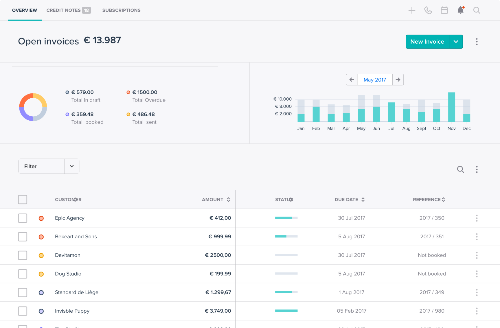
Users reported many usability issues with the existing invoicing module. I redesigned it end to end to make creating, managing and sending invoices faster and more intuitive.
Calendar and time-tracking
Time-tracking is central to Teamleader. The goal was to make tracking time effortless and surface useful insights.
Design System
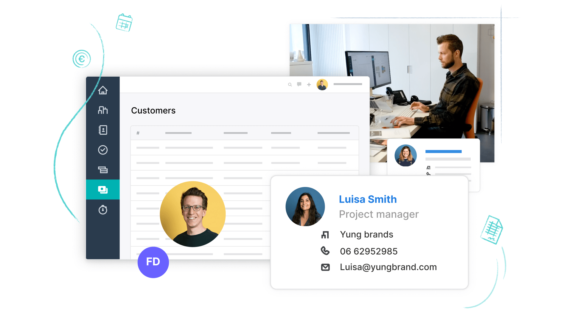
When I started working for Teamleader, the UI wasn't consistent at all, there was no single source of truth, it looked outdated and there were a lot of accessibility issues. The redesign of the invoicing module was an an opportunity for me to completely rework Teamleader's interface and start building a design system - what eventually became Teamleader Ahoy.
Coded prototype
I built realistic prototypes in code (React components) based on my designs. I started prototyping in code because image-based prototypes confused users during testing. They would say things like "why can't I click here" or "why can't I select a value". Using a design system that stays in sync with the codebase, code prototypes turned out to be more efficient and produced much better test results.
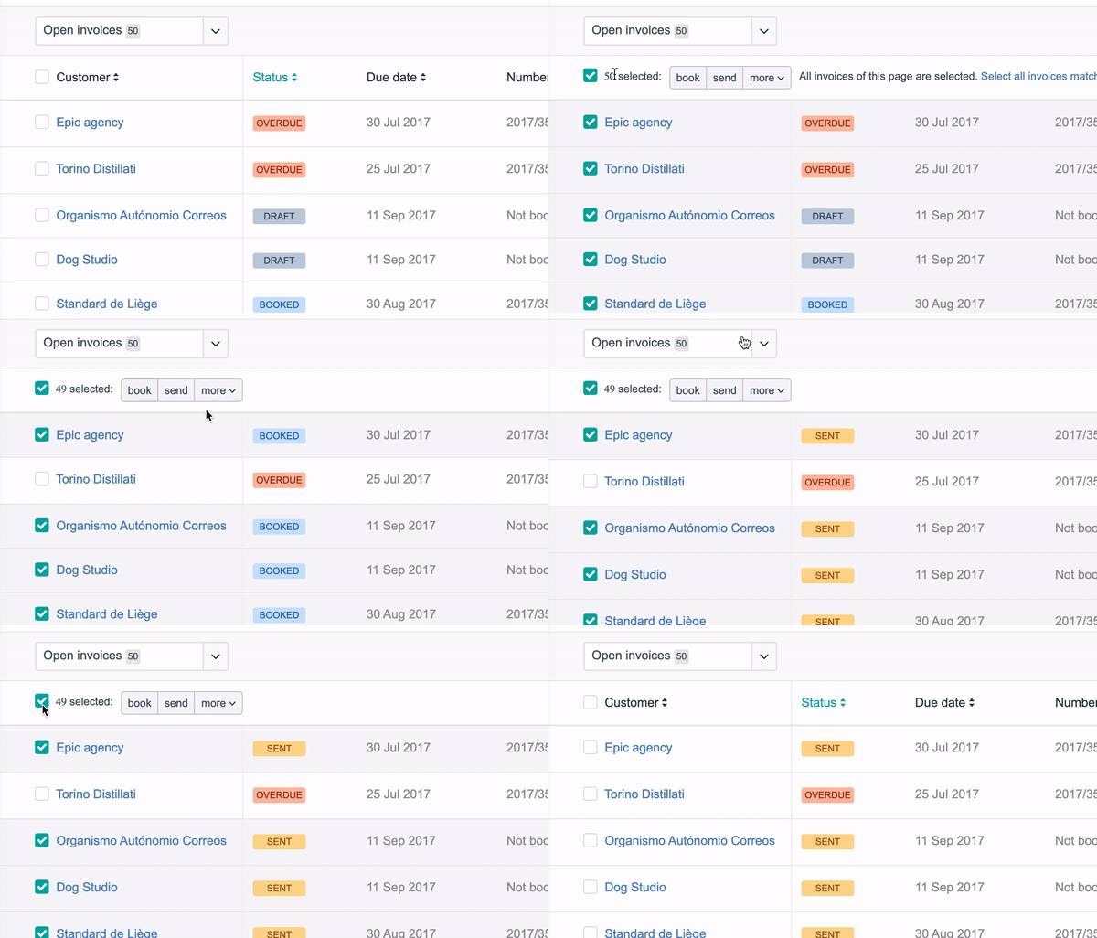
Bulk actions on the invoice lines in the initial interactive prototype I made.
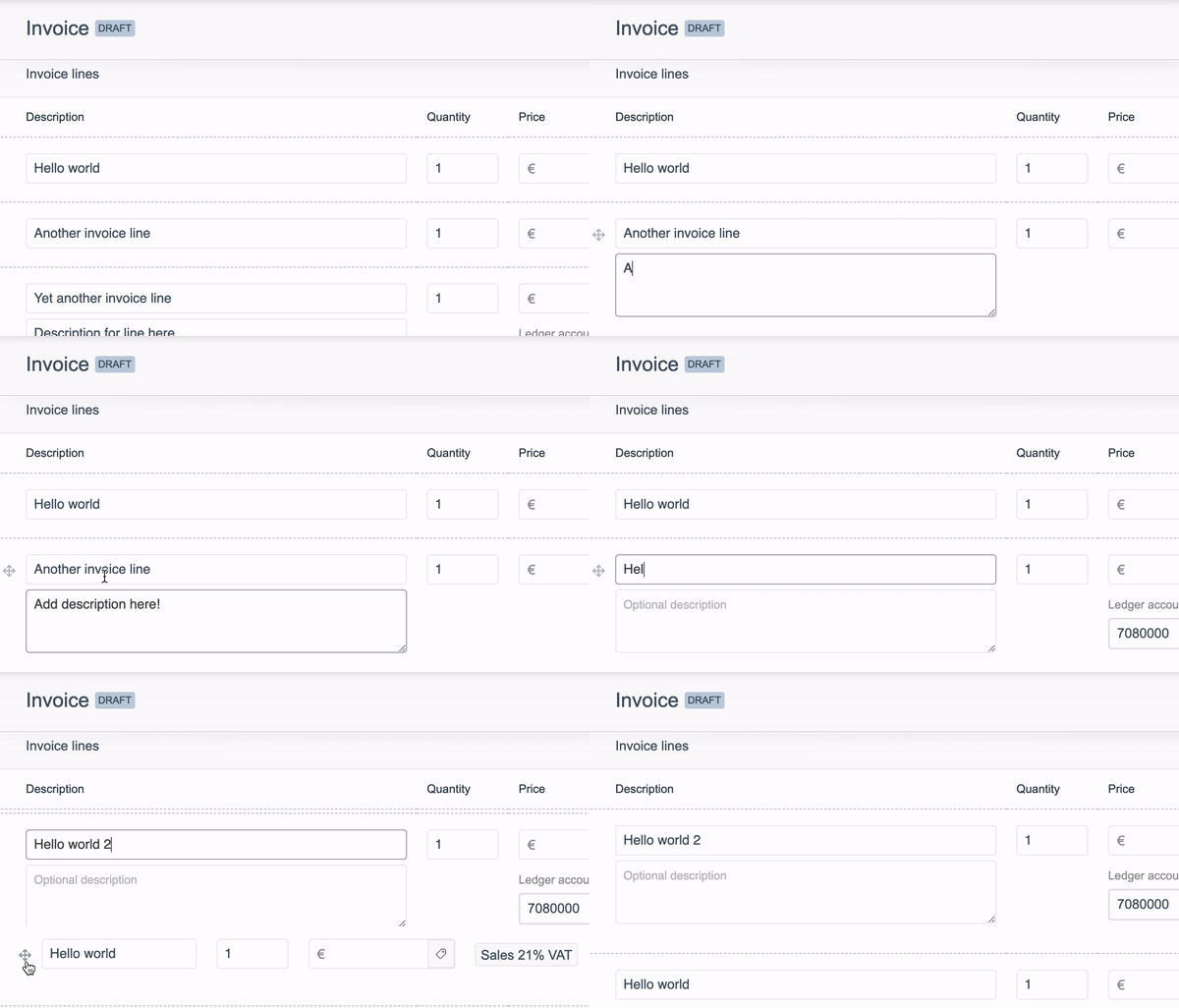
Some invoice line micro interactions that I designed directly in code (React).
Process
You can read more about my process on Intuo's Conversation Redesign case study.
End result
A selection of screens I designed for Teamleader.
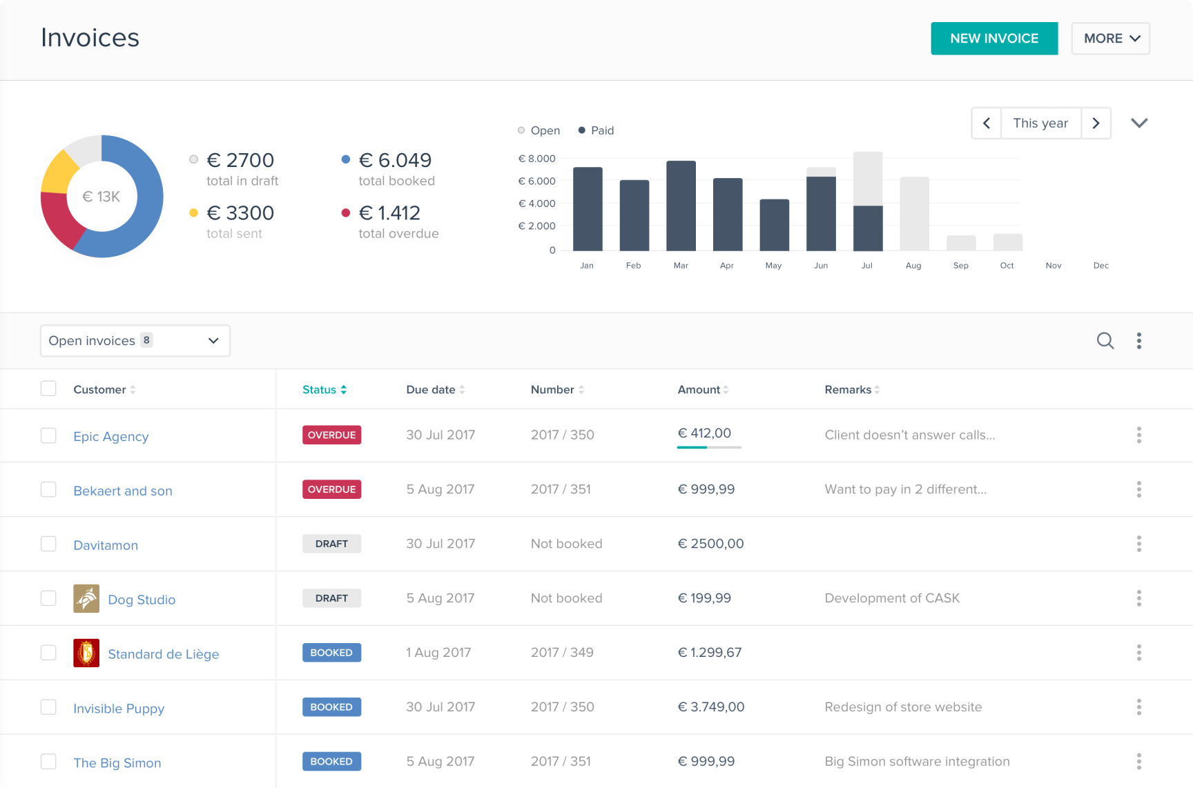
First iteration of the invoicing overview and the new visual direction.
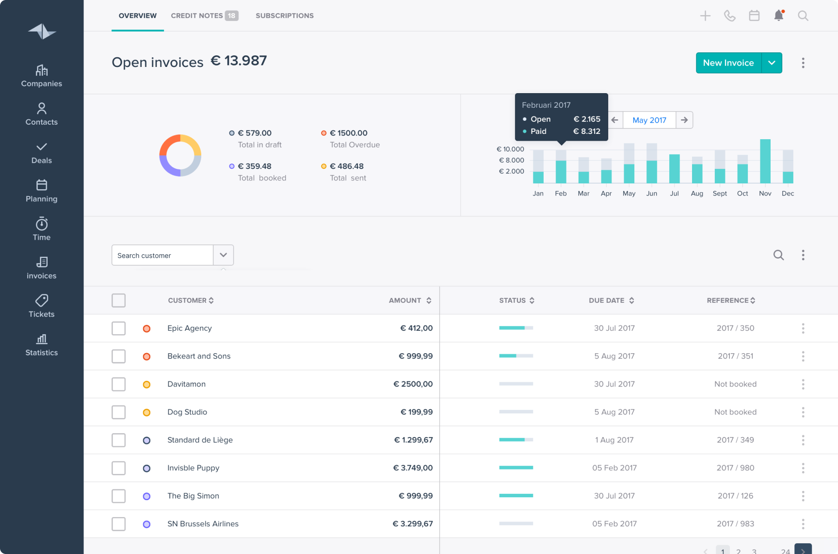
Final iteration with the refined visual language.
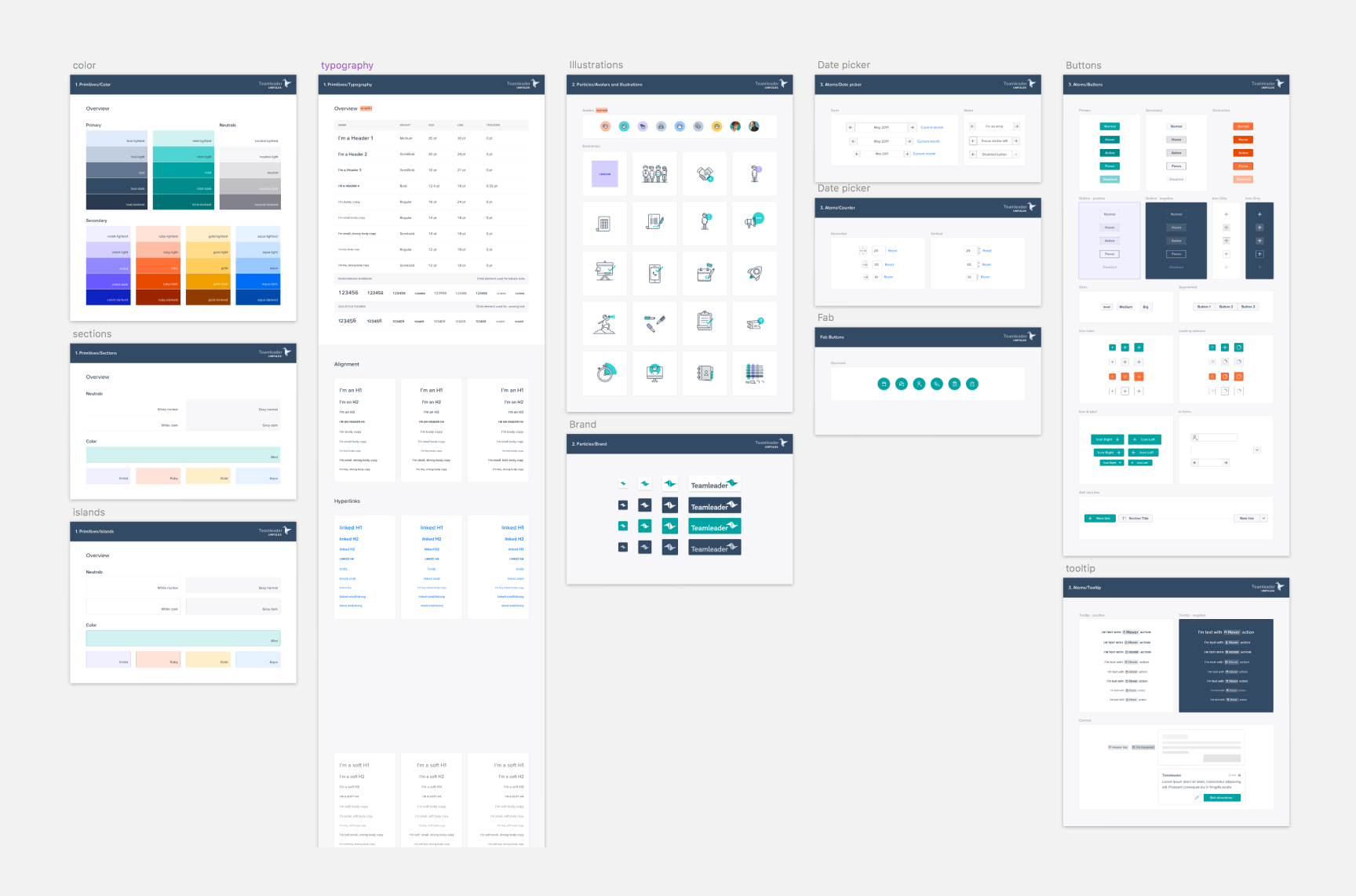
The style guide: first step towards what became Teamleader Ahoy.
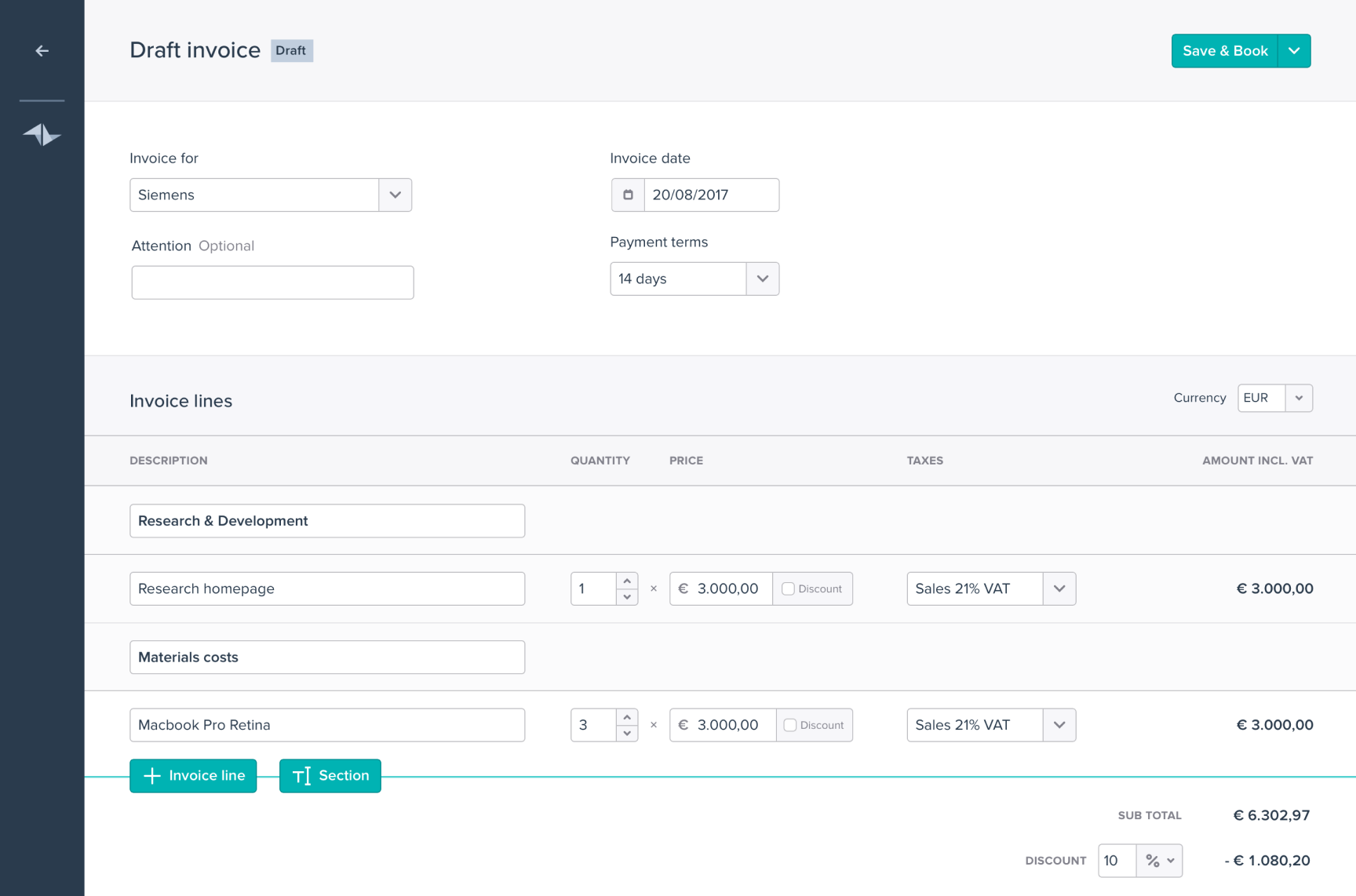
Create a new invoice.
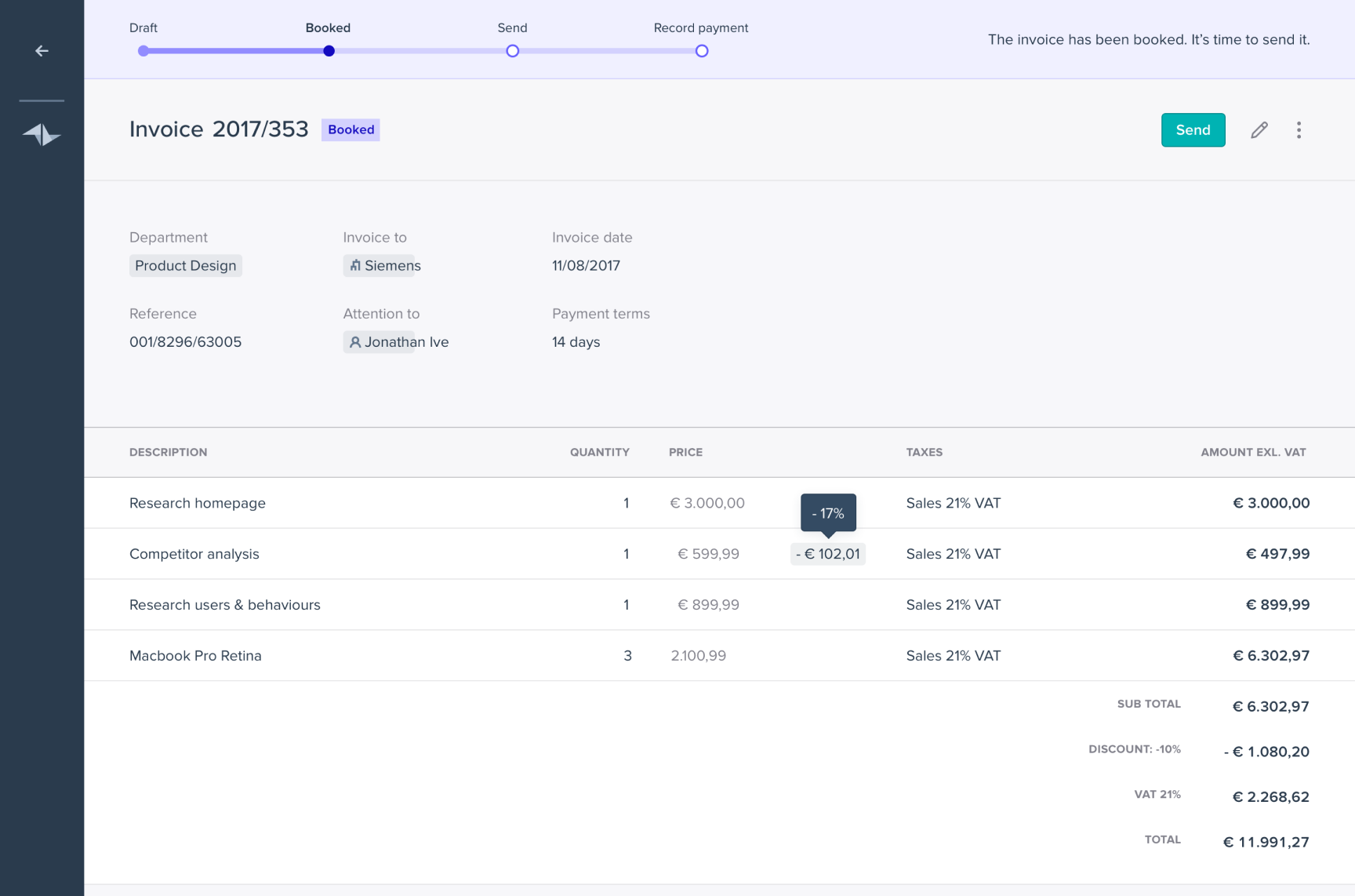
Detail view of an invoice.
Check out other projects
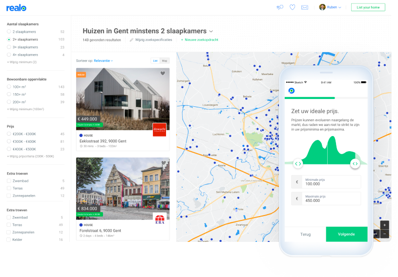
Redesigning search for a real-estate startup
How I redesigned Realo's property search experience to be faster, more intuitive and location-driven.
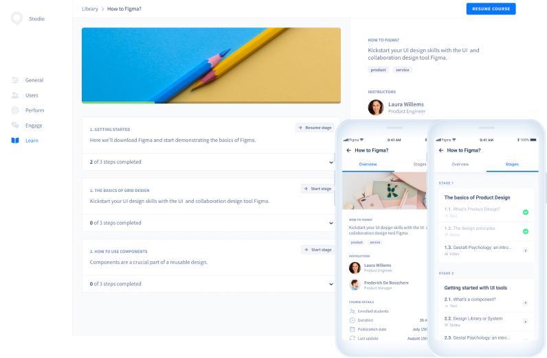
Redesigning a learning management system
Redesigning Intuo's employee training platform to improve content discovery and skill development.